I'm still behind this project, but I got a full-time job and have much less time for hobbies. However, I haven't really made an effort to find some time for blogging. I've been struggling with burnout.
Since my last posts I've been interested in Gregg shorthand, spanish sign language, German, meditation and heart rate variability as a tool to measure health (since my partner got me a Garmin smartwatch), among other things. I would like to write about these topics here.
I've been taking notes about these topics in Obsidian, but I don't know if my scattered notes and attention will translate well into blog posts. So I've been thinking about another site project, or subsection for this site, that would mimic the non-linear, node-link approach of Obsidian and other similar note-taking systems.
I think my writing problem calls for a two-pronged approach:
Reduce anxiety about writing perfectly. Stop trying to rewrite past posts because everything I write makes me cringe. Keep reflecting on why that happens.
Reduce the effort required for writing. Set up alternative systems for writing modularly or non-linearly instead of needing to order thoughts in paragraphs, such as templates or linked nodes. Think about other ways of sharing my experience or mood that do not require being verbal: emoji log, image and link collages, code snippets, color composition, data graphs... Use simple languages like toki pona (a 120-word constructed language).
A couple weeks ago, my partner and I took a train to spend some days around his hometown. One afternoon, we accidentally went around the entire skirt of a mountain, relentlessly harassed by insects (I had never seen so many). Without having planned it, we made one last effort to walk even further to see a big lake where swimming and fishing were permitted. I couldn't swim in it because I hadn't brought my swimwear.
I swim in pools regularly, a couple times a week for the past 5 years or so. I had been thinking about swimming in open waters besides the beach for some time. I unfortunately live in a city without much greenery, so I'd love to swim while sight seeing — but I don't have enough money to travel (even short distances) or buy a neoprene wetsuit at the moment.
At first, I was sad while I stared at the lake, unable to go into it. However, that night it crossed my mind for the first time that, if I was now serious about open water swimming, I would need to physically prepare myself for it first. And having something to work towards while I save money made me feel excited.
I've been back home for some days now. Today I broke a long streak of not being able to swim because of the trip and a bad cold that I've been recovering from. I was off to the gym with an objective in mind: see for how long I could swim laps without stopping nor touching the pool's floor.
I don't normally do resistance swimming. I swim for 20 to 40 minutes at a time and mostly do sprints for cardio, resting between some laps. I expected to last for around 30 minutes when not swimming for speed; but, to my surprise, I managed to swim for 1 hour and 15 minutes straight. I even felt like I could keep going, but I stopped because I was hungry for lunch already (and wrinkly as a raisin).
Being able to swim for one hour in a pool would probably amount to around 30 minutes in open water (currents and cold are very tiring) so I still have a lot of training to do and long hours to swim. Thankfully, lengthy swimming is a little less dull while listening to music or podcasts with my waterproof mp3 player, one of the best buying decisions I've made.
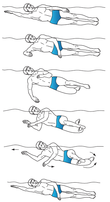
Today's swimming has also been stimulating for another reason. A few days ago, I had the shower thought that front crawl, backstroke, breaststroke and butterfly couldn't possibly be all existing swimming strokes. An awkward Internet search for "weird swimming strokes" revealed to me the sidestroke. It's a very energy-efficient stroke because of the long gliding it generates, and so it is used by lifeguards, the military and long-distance swimmers.
With one side upwards, the kick is done by separating the legs by the knees, one to the front and the other to the back, and then bringing them together swiftly. At the same time, the arm from the upper side pushes water towards the feet, and the other arm stretches forward for the glide before bringing the arms together for the next stroke. Here's how it looks:
I was eager to try it today, and I was surprised to find that I could already get the hang of it with both sides, with some repetition. I ended up using exclusively sidestroke in the last 20 minutes of the swim, because it was indeed less tiring and just as fast as breaststroke or backstroke.
I'll be testing my resistance further soon. I'm happy that, between my new long-distance objective and a new stroke, I could still bring some novelty into a hobby that goes all the way back to my childhood.
No soy un usuario técnico, pero Linux me ha llamado la atención desde hace años. Vale, supongo que sí que soy un usuario más técnico que mis padres. También me interesa aprender sobre ordenadores, pero los motivos principales por los que me atrae Linux son sociales.
No tengo suficiente dinero como para andar comprando licencias de sistemas operativos.
Quiero apoyar el software libre y gratuito porque me parece una alternativa moralmente superior y, a menudo según mi experiencia, también superior a nivel técnico. Es el equivalente en software a apoyar proyectos colectivos sin ánimo de lucro como bibliotecas o Wikipedia, con intención anticapitalista y al servicio del usuario antes que al servicio del mercado.
Quiero usar un sistema operativo más eficiente con los recursos de mi portátil, para una vida más larga de la batería.
La experiencia, de momento
Instalé Linux Mint (una de las muchas distribuciones, "distros", de Linux) en mi portátil, junto a Windows 10. He configurado un dual boot, es decir, tengo una partición de Windows y otra de Linux y cada vez que mi ordenador se inicia aparece un menú en el que puedo elegir rápidamente si quiero arrancar con un sistema operativo o el otro.
Por lo visto, Linux Mint es una distro muy recomendada para personas novatas, tanto por su parecido con Windows como por su proceso de instalación y comunidad.
Instalación
Para mí la instalación fue relativamente sencilla, pero creo que usuarios novatos no técnicos encontrarían dificultades. Es un proceso con bastantes pasos, por lo que es más fácil atascarse en alguno de ellos. Además, la configuración de BIOS (arranque) de cada modelo de ordenador es distinta, y muchas personas se sentirían intimidadas si tuvieran que orientarse sin ayuda de tutoriales en esos menús, pensados para usuarias avanzadas.
Funcionamiento
La marca que fabrica mi portátil cuenta con su propio programa para controlar ciertas opciones de hardware, como por ejemplo el bloqueo de carga de la batería por encima del 60% para extender su vida útil, o botones dedicados en el teclado para cambiar entre distintos modos de consumo de energía (potencia turbo, normal o de ahorro), activar y desactivar el touchpad, etc.
Estos botones, sin ese software, no hacen nada. El software debería poder comunicar a la usuaria, desde cualquier sistema operativo que haya decidido instalar, con su portátil físico. Sorprendentemente, sólo está disponible para Windows. He encontrado una alternativa no oficial para Linux, pero el proceso de instalación está siendo muy complicado y no he conseguido hacerlo funcionar... Aún no tengo ni idea de lo que es un kernel.
Una cosa que me sorprendió poder hacer sin problema es acceder a todos mis archivos de mi partición de Windows desde mi partición de Linux (a la inversa, obviamente, es imposible).
Sin embargo, al principio obtenía errores en varias aplicaciones al intentar guardar archivos en la partición de Windows desde Linux. Tras una búsqueda rápida vi que era debido a que Windows tenía activada la opción de "arranque rápido". Eso significaba que Windows, en lugar de cerrarse al apagar el sistema, se mantenía en hibernación para que el próximo inicio fuera más rápido, esencialmente manteniendo los archivos "secuestrados" mientras usaba Linux. Una vez localizado el problema, desactivar esa opción fue muy sencillo.
El touchpad a veces deja de responder, aunque curiosamente se "despierta" después de tocar alguna de las teclas de función, como las de volumen.
La batería dura más mientras uso Linux Mint.
La interfaz de usuario es intuitiva, bastante parecida a Windows 10.
Conclusión
De momento y pese a las dificultades, estoy satisfecho con Linux Mint y la personalización superior que permite. Dudo que vuelva a instalar Windows en un futuro, aunque con este ordenador lo sigo usando de tanto en cuando por comodidad.
Si nos cononcemos personalmente y te interesa probarlo pero tienes problemas para hacerlo, me encantará ayudarte.
I mainly read non-fiction, but I like to read fiction as well if any aspect of the story, characters, writing style or fictional universe is new, weird or relatable enough to me to pique my interest.
I liked some aspects of the books, I'm not even sure if I liked them as a whole. But they've certainly left some impression in me, which is something I value. Both felt quite slow and uninteresting to me at the start, but somewhere along the middle of the book the story picked up, and interesting, suspenseful and crazy things were constantly happening—which made it difficult to put the book down at times.
I'm still not sure if I didn't totally get the stories or if there's not that much I should get. But I appreciate their dreamy quality, imagery and characters.
Here's a list of my favorite things from each story:
Spoilers for both books
Kafka on the Shore:
The "afterlife" town after the "entrance stone".
Nakata and Hoshino. Nakata is a really calming character to me; so is Hoshino learning to let go of things in order to follow Nakata and "see what happens".
Sputnik Sweetheart:
The Ferris wheel scene and Miu's two selves.
The mysterious music K hears outside and how it appears to connect the "two worlds".